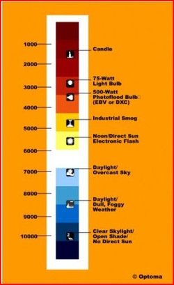
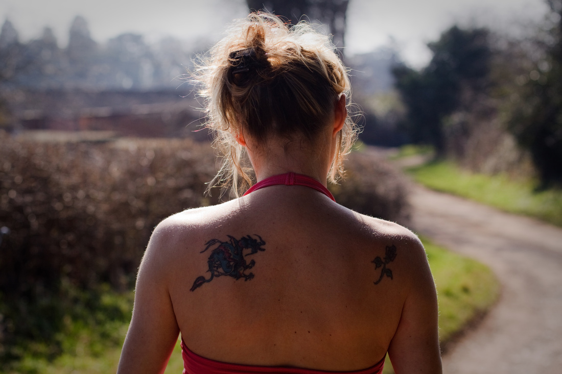
I have used Raw as my preferred shooting mode for a few years and use Lightroom to apply WB settings post-shoot. This is perhaps a rather lazy approach but has suited me until now. However the 2nd assignment of the course requires all the images to be taken as large size jpeg's and I realise I have become perhaps less conscientious when shooting and more reliant on post-processing. Hence I need to get into the habit of adjusting the WB setting on my camera pre-shoot as the wrong choice might spoil an otherwise acceptable image. As Kelvin temperature increases light changes from red to yellow to blue, a colour usually associated with coolness . The blue light of the higher Kelvin temperatures creates redder tones, whilst the lower temperature of yellow light will produce a bluer hue. So when describing the overall appearance of an image as cool or warm I am not talking about the actual Kelvin temperature but the effect the light has on the subject as I see it.
Exercise Colour cast and white balance
Cloudy day with a grey overcast sky
Auto WB : Colour temperature K5100 when using my camera's auto WB the resulting image has the same colour temperature as the Daylight WB. My subject's skin looks pale and rather washed out with a blue tinge , not flattering at all ! The brickwork behind is a dull orange.
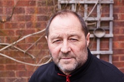
Daylight WB : Colour temperature K5100. it was a cloudy day I was expecting this WB setting to improve on the camera's Auto WB. Again the skin tones have little natual looking colour. However I do feel my subject looks a bit less washed out and the image is a slight improvement than that produced by the Auto WB .

Cloudy WB : Colour temperature K5800 setting produced a much more natural image with flattering skin tones, with still quite dull but brighter brickwork behind. An improvement on the Auto and Daylight WB settings.

Shade WB: Colour temperature 6600 this is a much warmer looking image I personally feel the skin tones ,especially around the hairline, are too orange.

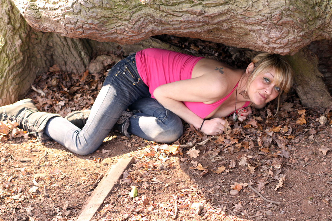
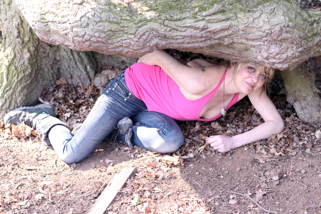
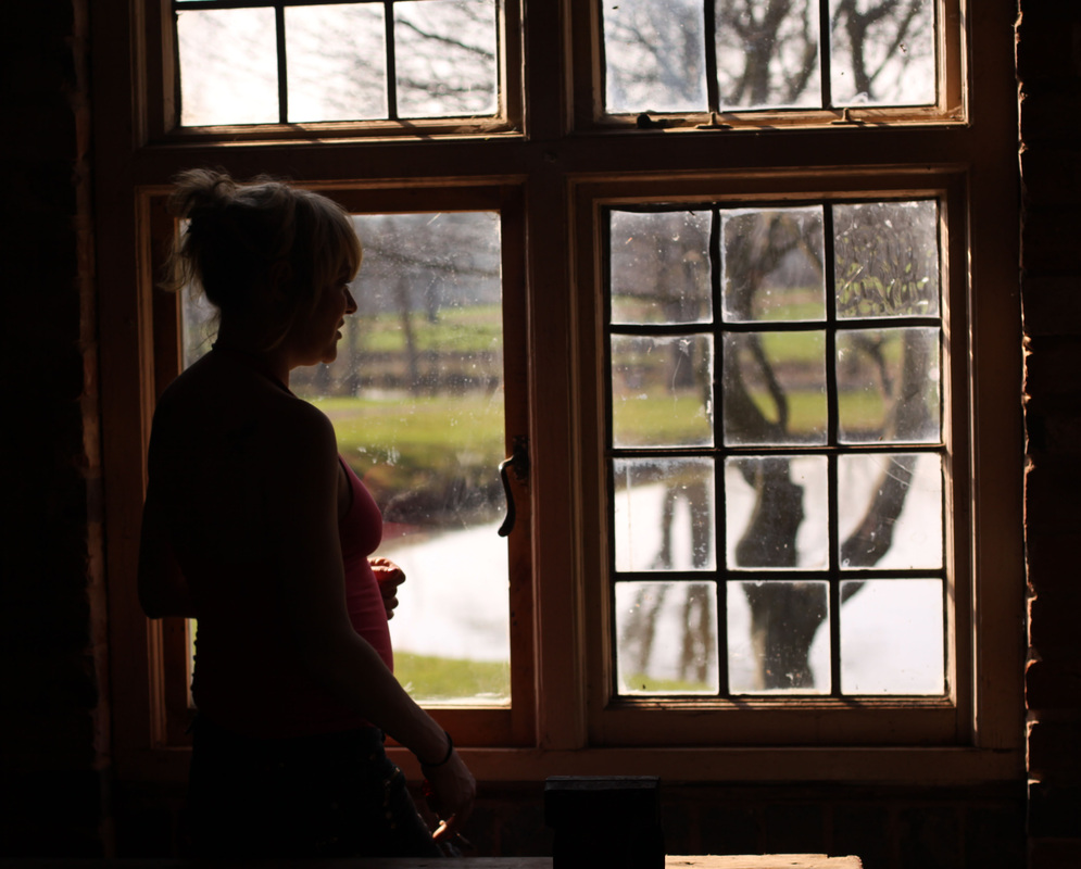
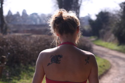
Open shade on a sunny day
The next two images below were taken within minutes of each other on a clear bright sunny day with my subject in the shade of an old tree trunk. The top image using a shade WB setting has enhanced the tones of her skin and the surrounding area , the hue of her pink top has become deeper and much more saturated. In comparison a Daylight WB setting has caused the camera to record pale rather washed out tones , they are not flattering to my subject , or record the scene as I saw it. Light is coloured, changing throughout the day, however whilst the human eye easily adjusts to these colour differences the sensor cannot. It simply records what is sees and is unable to make the same allowances the human brain is capable of .
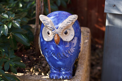
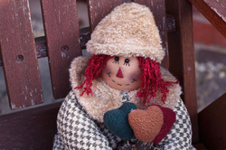
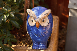
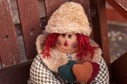
I decided to use two more subjects for my open shade images,an orange haired rag doll and a blue pottery owl. I was interested to see how the cool tones of the owl compared with the warmer tones of the doll depending on the WB chosen.
The auto WB has not done a bad job for either image but I think the colours are enhanced more by the choice of shade or even the cloudy WB settings. They become deeper and richer in tone, some of the richness of the colour is lost using an auto or daylight WB.
The auto WB has not done a bad job for either image but I think the colours are enhanced more by the choice of shade or even the cloudy WB settings. They become deeper and richer in tone, some of the richness of the colour is lost using an auto or daylight WB.
 |  |
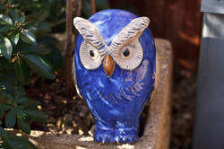
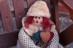
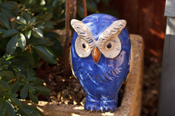
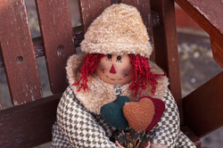
Daylight WB
 |  |
Shade WB
Both images now have a much warmer appearance with deep tones.
Both images now have a much warmer appearance with deep tones.
 |  |
Cloudy WB
Not bad but I actually prefer the deeper richer tones created by the Shade WB.
Not bad but I actually prefer the deeper richer tones created by the Shade WB.
 |  |
Sunny day
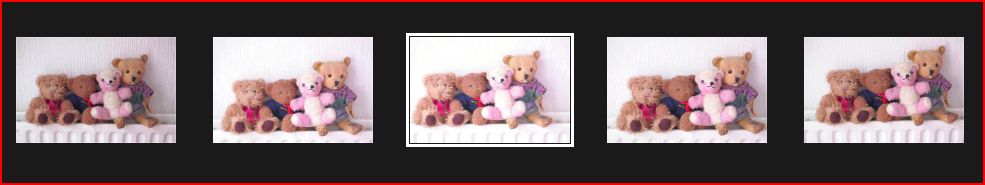
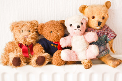
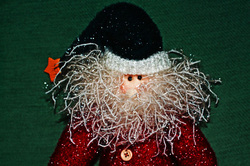
This being Britain I had to be patient and wait for a sunny day to take these images ! I used Old Ted (he's as old as me and I am not saying how old that is !!!) . He makes a very patient subject who never complains,I use him frequently for photo projects. With the exception of the Auto WB any of these settings would be acceptable because of the subject I chose. Although it was sunny the Cloud and Shade WB settings enhance Ted's fur , making the tones deep and rich. The WB setting is a useful way of controlling the final image and not rely on the camera's Auto setting.
Auto WB . Ted is too pale.
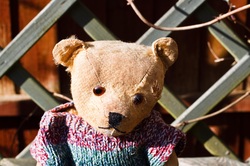
Daylight WB.

Cloudy WB

Shade WB

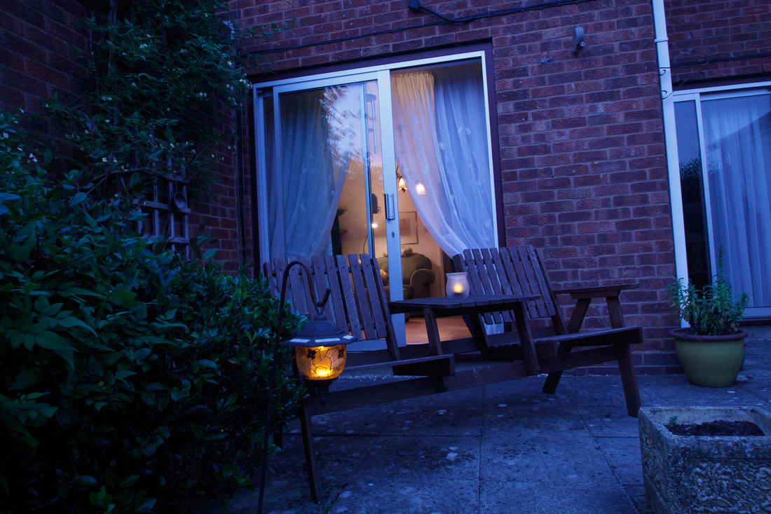
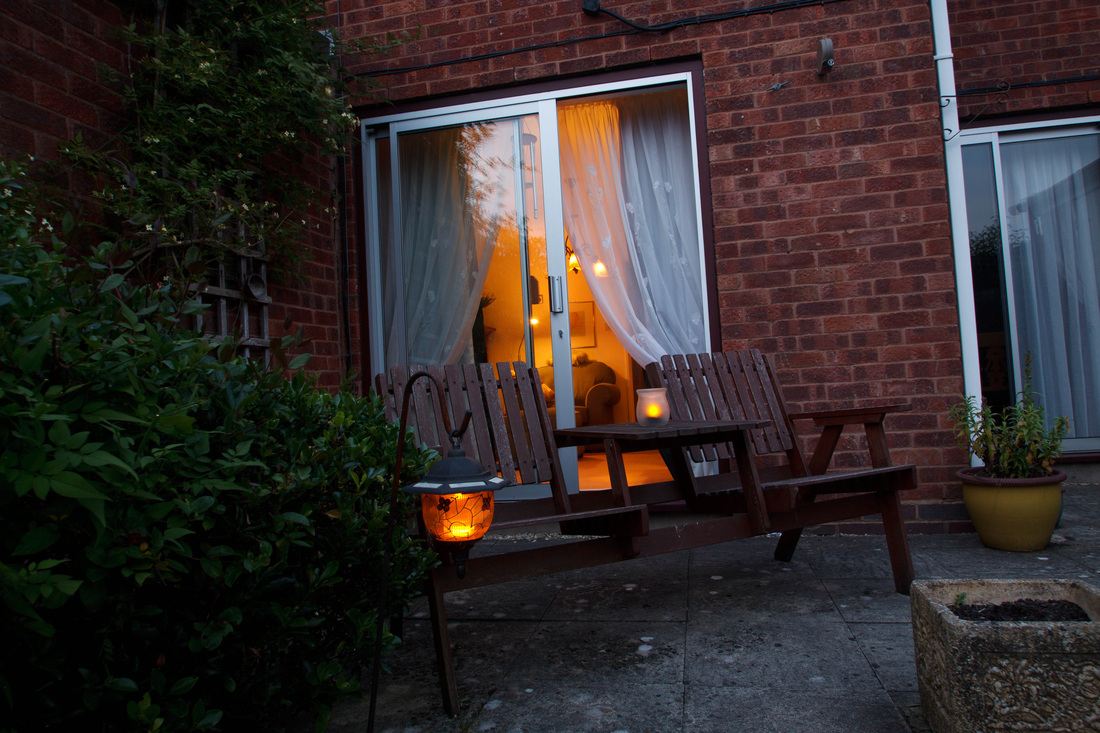
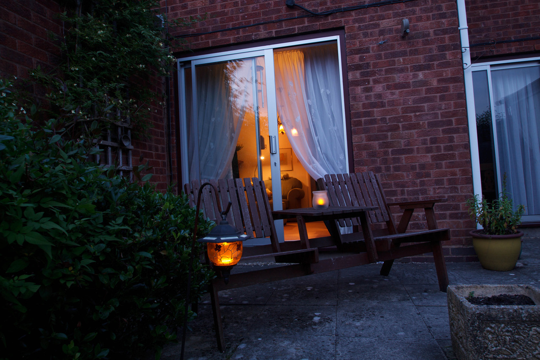
Mixed light
Three images shot from outside within a few seconds of each other looking back indoors at dusk on a very clear evening.
Viewed large the Tungsten WB setting has produced the most neutral toned natural looking image . The walls indoors are whiter than those rendered by the AWB and Daylight WB settings which make the light indoors very unnaturally orange toned . However the warm glow from indoors looks welcoming , using the wrong WB is not always such a disaster, it really depend on the wanted outcome !
Tungsten WB AWB Daylight
 |  |  |
Conclusion.
Setting the correct WB setting when shooting Jpeg is crucial to creating better looking images, however used imaginatively it can also be used creatively. WB is easily remedied when shooting Raw if a mistake is made at the time of shooting.
Setting the correct WB setting when shooting Jpeg is crucial to creating better looking images, however used imaginatively it can also be used creatively. WB is easily remedied when shooting Raw if a mistake is made at the time of shooting.


 RSS Feed